MONTER LITE
Real world project | Retail Website Redesign
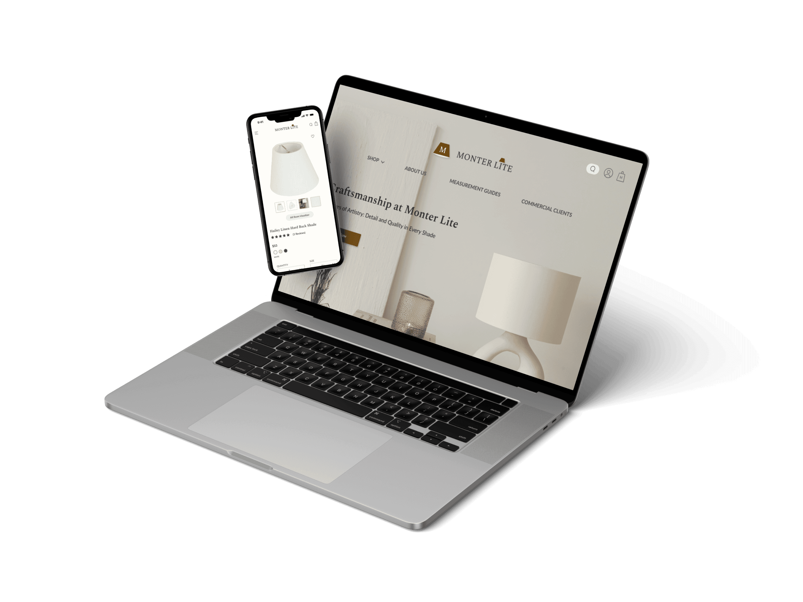
Project Overview
History of Monter Lite
Monter Lite is a lampshade company focused on wholesale distribution. It was founded in 1995 by my late uncle John and his close friend Jerry. The company prides itself on its commitment to tradition, high quality, and swift service. At its peak, Monter Lite had more than 1,000 loyal commercial clients, and its extensive inventory coupled with quick delivery services secured its prominent status in the lampshade industry in the early 2000s in the United States.
Role: UX Designer
Tools: Figma, Canva, Zoom, Discord
Date: Jan 2024
Duration: 3 weeks
Stakeholder Interview
UNCOVERING COMPANY CULTURE AND BUILDING EMPATHY THROUGH STAKEHOLDER INTERVIEWS
I initiated the project with a meeting with Monter Lite’s CEO, Jerry Lin. During the meeting, Jerry provided an overview of the company's history, including its founding, growth, and the challenges it currently faces.
Addressing Challenges and Emerging Needs
In its early years, when the internet was less developed, Monter Lite established itself as a pioneer in the lampshade industry in the United States. Their main source of revenue came from wholesaling to physical lighting stores, and their website primarily functioned as a catalog to showcase their extensive selection of lampshade designs to these business clients. However, as time progressed and online shopping emerged as the foremost choice for consumer buying, Monter Lite recognized the need for modernization. They are now looking to enhance their online presence and appeal to a broader audience, making it easier for the general customers to directly order lampshades from their website. The focus is on updating their website to meet current standards and expand their customer base beyond just business clients.
Style of the website: a warm color palette inspired by the ambiance of a lampshade.
A designated section that tells customers what sets them apart from other lampshade companies.
Virtual fitting function
the ceo’s expectations
Company Values
Traditional
Premium Quality
Quick Service
research
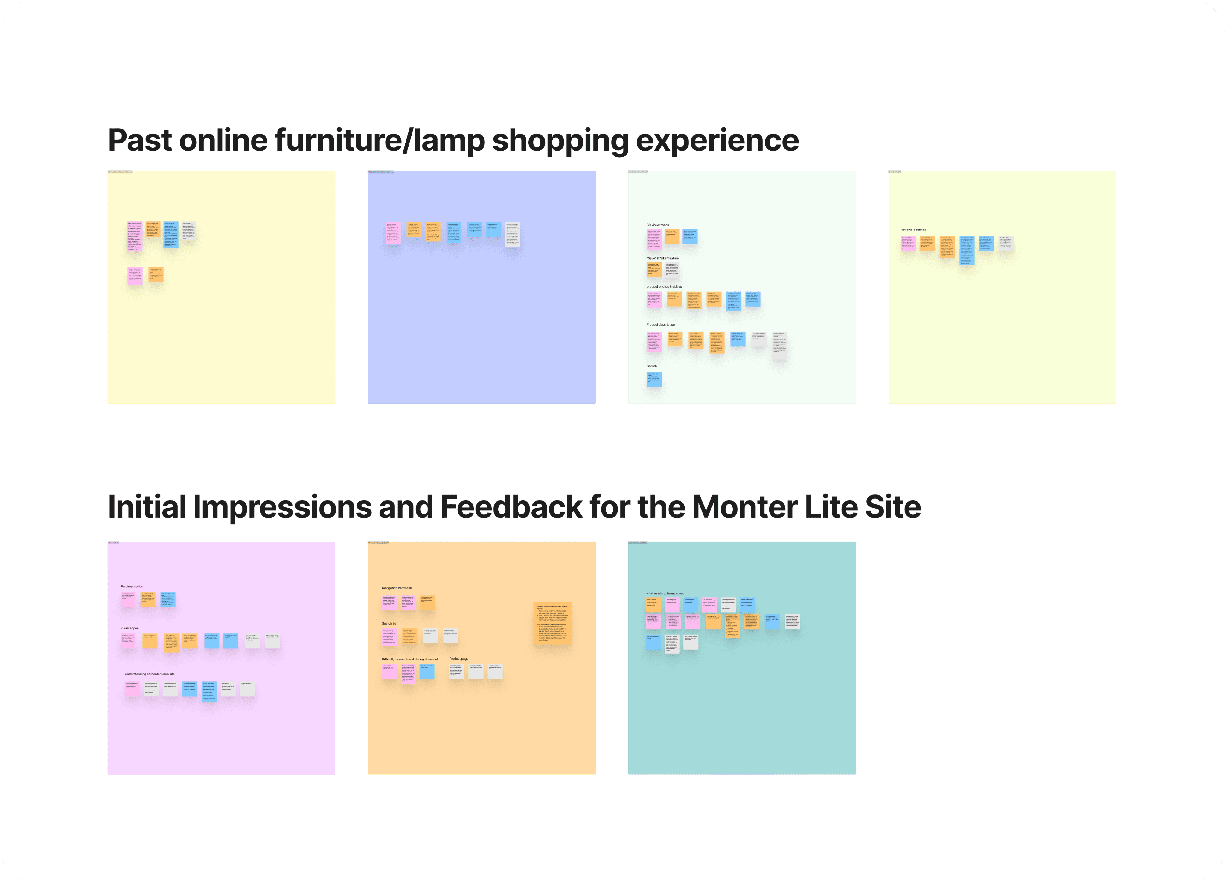
In the initial research stage of the Monter Lite’s website redesign, I conducted interviews with 4 individuals regarding their previous online furniture and lamp shopping experiences. After these interviews, I synthesized the information collected into an affinity map, which helped to streamline and categorize the insights.
Number of interviewees: 4
Interview platform: Zoom
Duration per interview: 40 minutes
User Interview & pre-testing
In the research phase of the project, I initiated a series of interviews to delve into users' previous experiences with purchasing furniture or lampshades online. This step was crucial in laying the foundation for a deep understanding of user behaviors and preferences, serving as a guiding light for the entire redesign process. Following these interviews, I conducted hands-on testing of the existing website. This practical approach allowed me to observe real-time interactions, pinpointing specific pain points and difficulties users faced. By gathering firsthand feedback, I was able to direct the redesign efforts toward solving these identified issues. These research methods ensured that the redesign focused sharply on enhancing usability, making the website not just visually appealing but significantly more user-friendly.
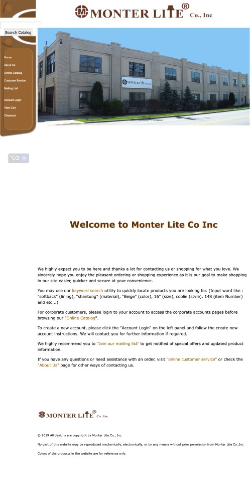
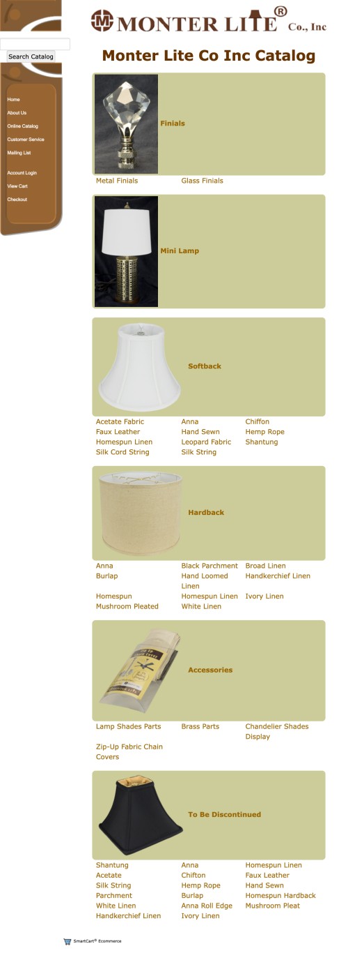
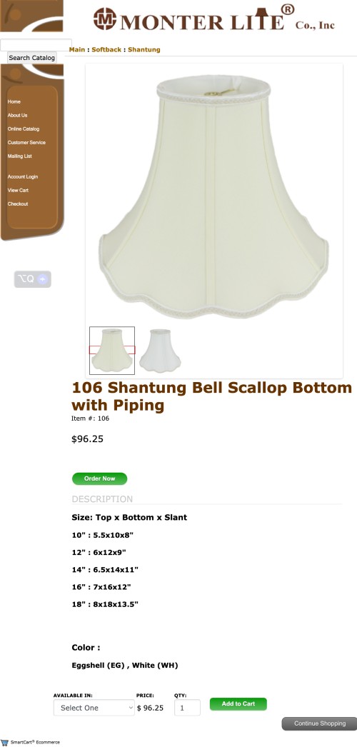
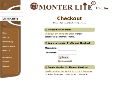
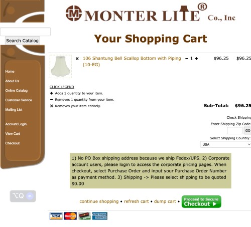
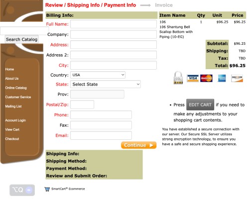
Monter Lite’s Website BEFORE the Redesign:
interview findings
Things that users enjoyed when shopping for furniture online:
3D visualization capability
“Save” and “Like” feature
Advance filtering and searching tools
Clear product categorization
Customer reviews and photos
Detailed product description including size, material, and delivery information
Clear and concise product description
Difficulties that users encountered when shopping on furniture websites:
1. Poor search functionality
2. Overwhelming volume of information displayed
3. Non-transparent shipping and delivery details
4. Unclear product size information (lacking visualization)
Pre-testing findings
Users’ impression of Monter Lite’s website
1. Outdated design reminiscent the early 2000s
2. Unclear site purpose and offerings
3. Most viewed it as wholsale-focused
4. While functional, the website lacks a user-friendly experience that appeals to general consumers
5. The product has a luxury feel, but the website is not reflecting it
Difficulties that users encountered
1. Having the navigation bar on the left is not in keeping with modern user expectations and detracts from the site’s usability
2. The search bar is poorly optimized, making it difficult to use effectively
3. Some of the product images were zoomed in too closely, making it difficult for users to get a clear view of the overall product
4. User mentioned having to guess the meaning of product description due to the lack of clarity
5. Users experienced confusion while looking for a 14-inch lampshade; It was available for purchase but the product description did not clearly indicate this option
Suggestions from testers
1. Redesign and better organize the homepage for a streamlined experience
2. Improve organization of product listings for easier browsing
3. Enhance readability by simplifying industry specific language/minimize industry jargon
4. Incorporate a filter feature on the product page to simplify user navigation
5. Implement a “like” function to allow users to revisit their choices with ease
Affinity Map
An affinity map was created to organize and summarize the insights from user interviews.
User Personas
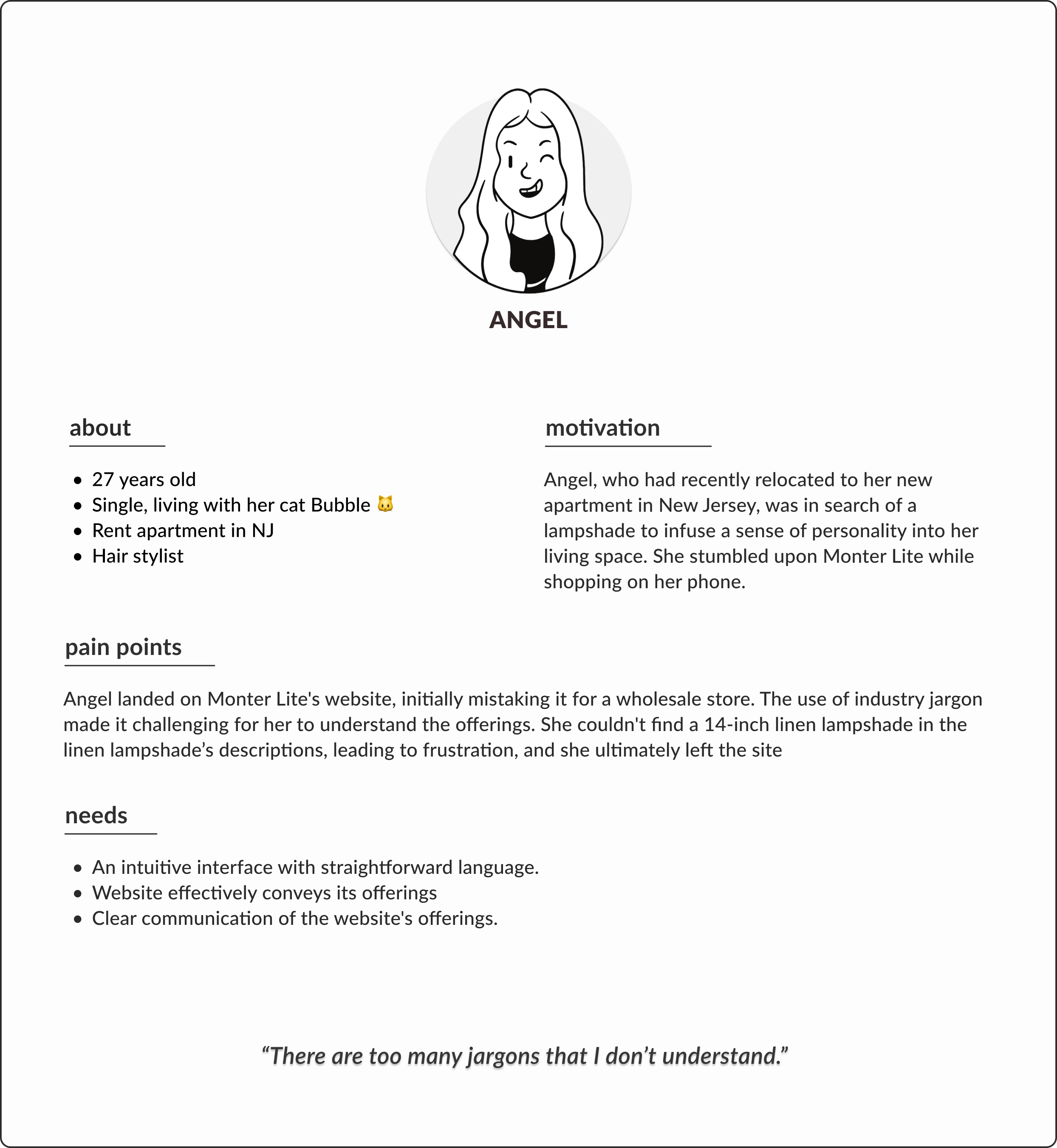
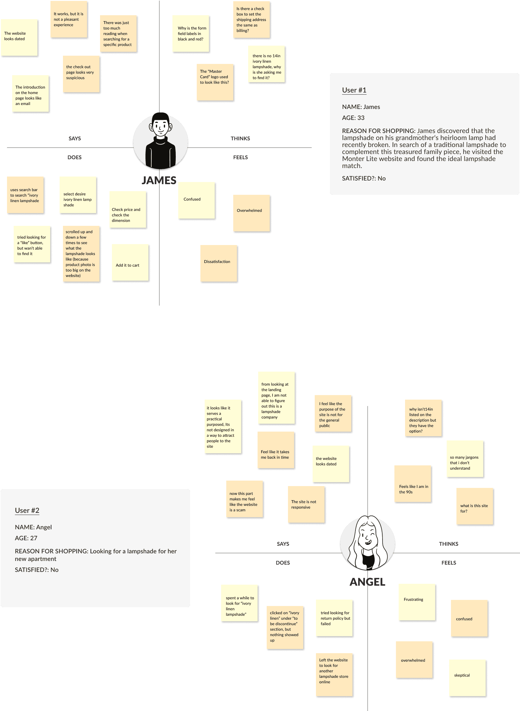
User personas and an empathy map were developed to gain a deeper understanding of users' pain points and empathize with the challenges encountered while navigating the Monter Lite website. These tools inspired solutions that addressed these issues, guiding a user-centered design approach for the redesign project.
User Persons:

Empathy Maps:
User & Task flows
Creating user and task flows allowed me to oversee and design the user journey from a high-level perspective, from initial browsing to selecting a product and proceeding through the checkout process. This process enabled me to identify and refine the paths users follow, enhancing their experience by ensuring a seamless transition between steps and improving the site’s overall usability.
LOW FIDELITY WIREFRAMES
Desktop Screens
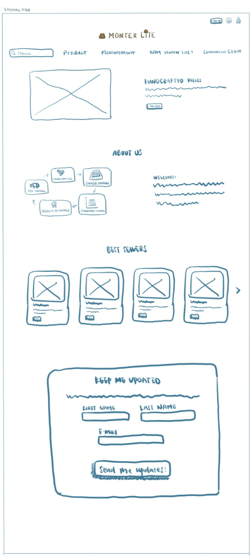
Landing page/Home page
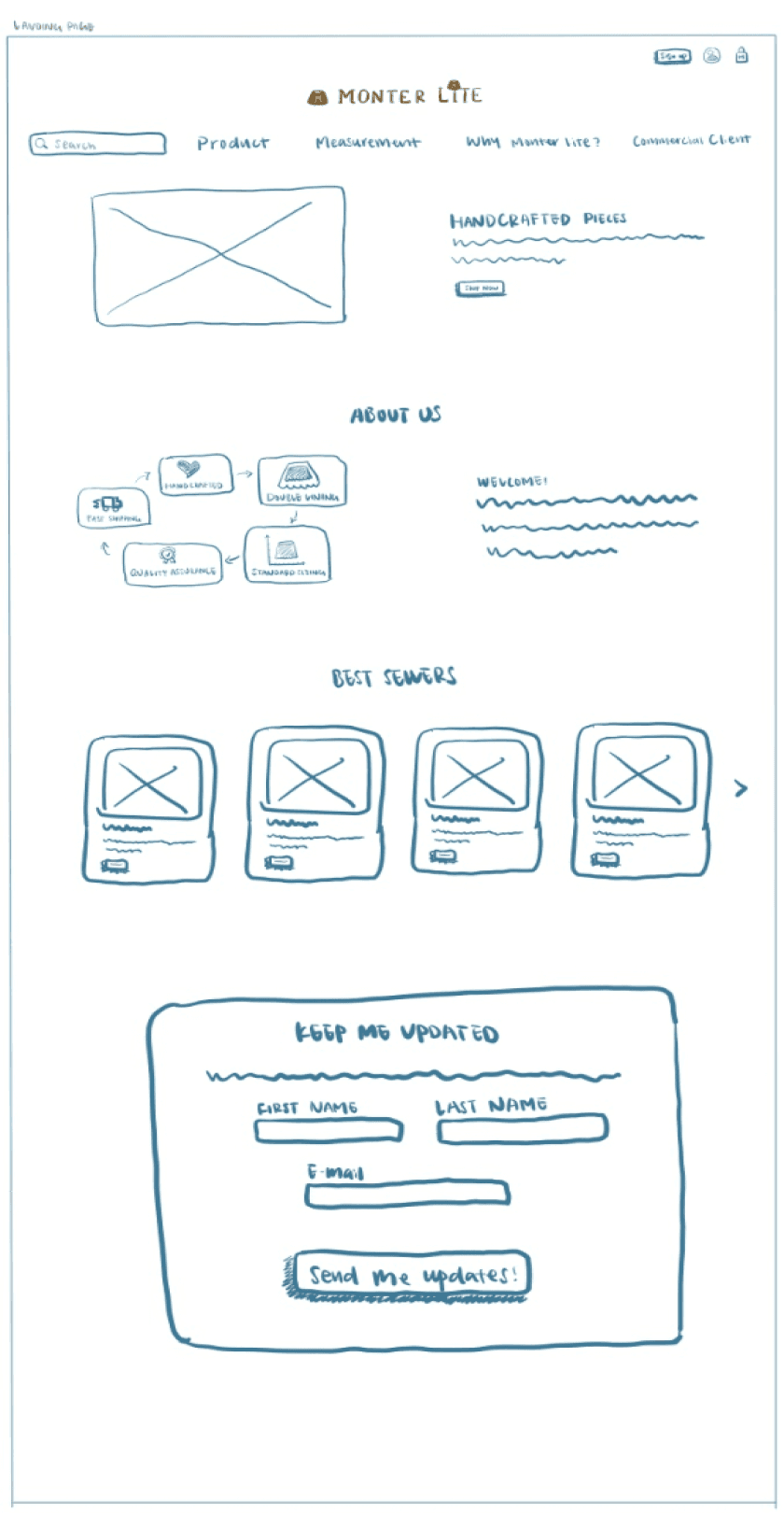
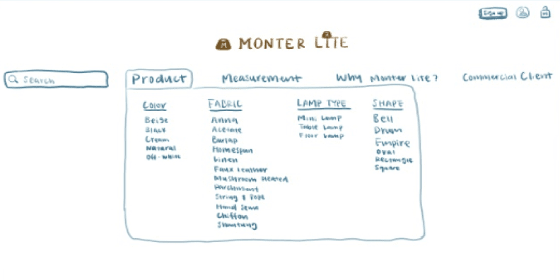
Landing page/Home page
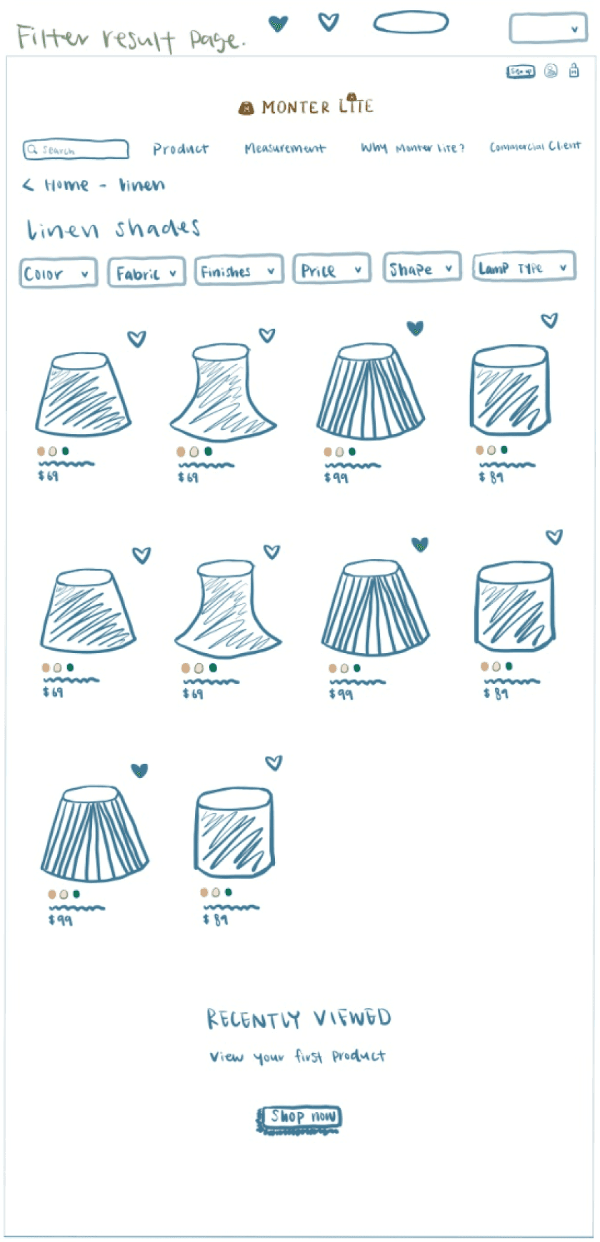
Desired fabric product page
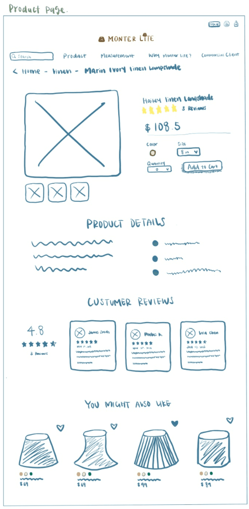
Detail product page
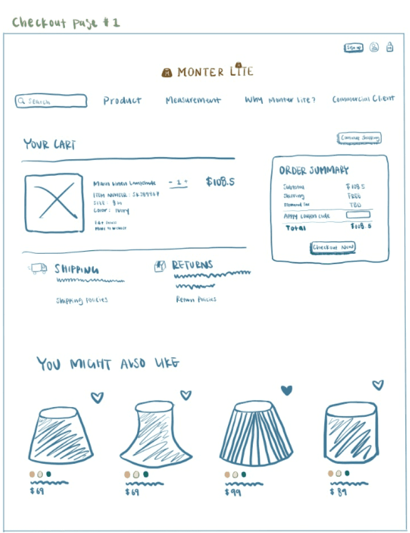
Cart page 1
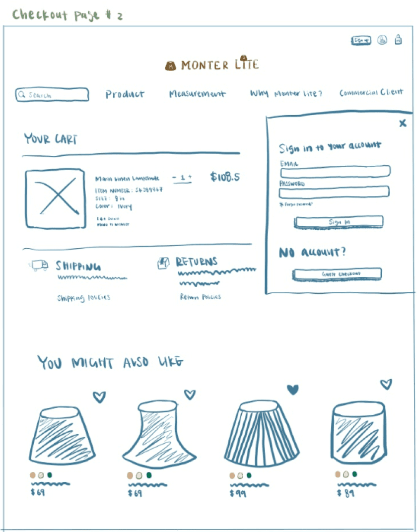
Cart page 2
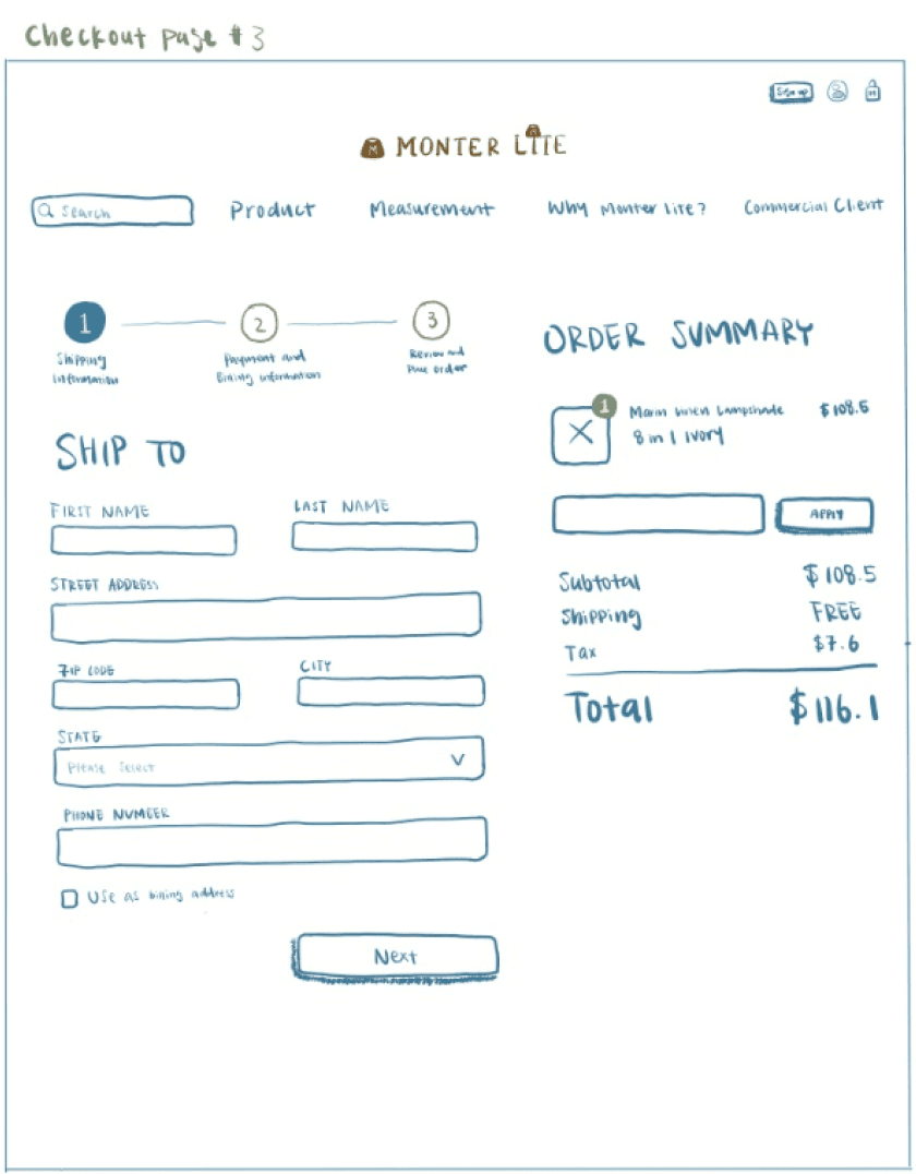
Checkout page #1
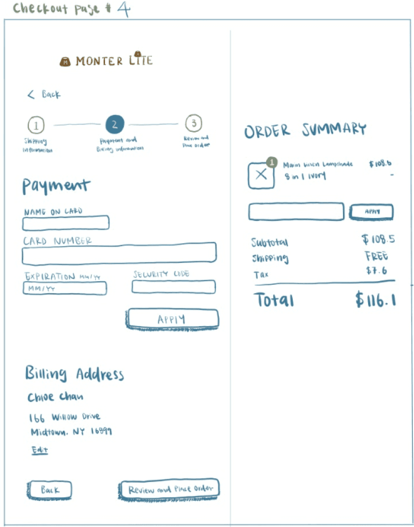
Checkout page #2
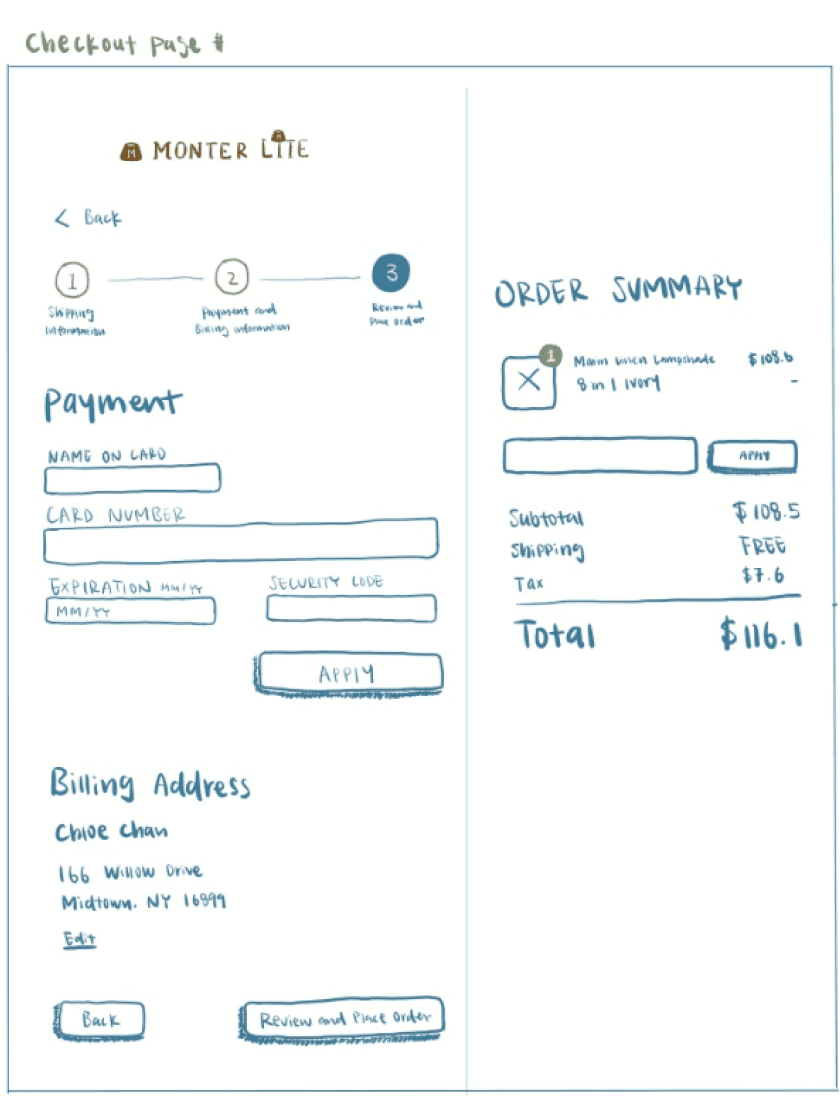

Checkout page #3
Mobile Screens
Landing page/Home page

Desired fabric product page

Detail product page

Branding
Client's Vision for Website Aesthetics
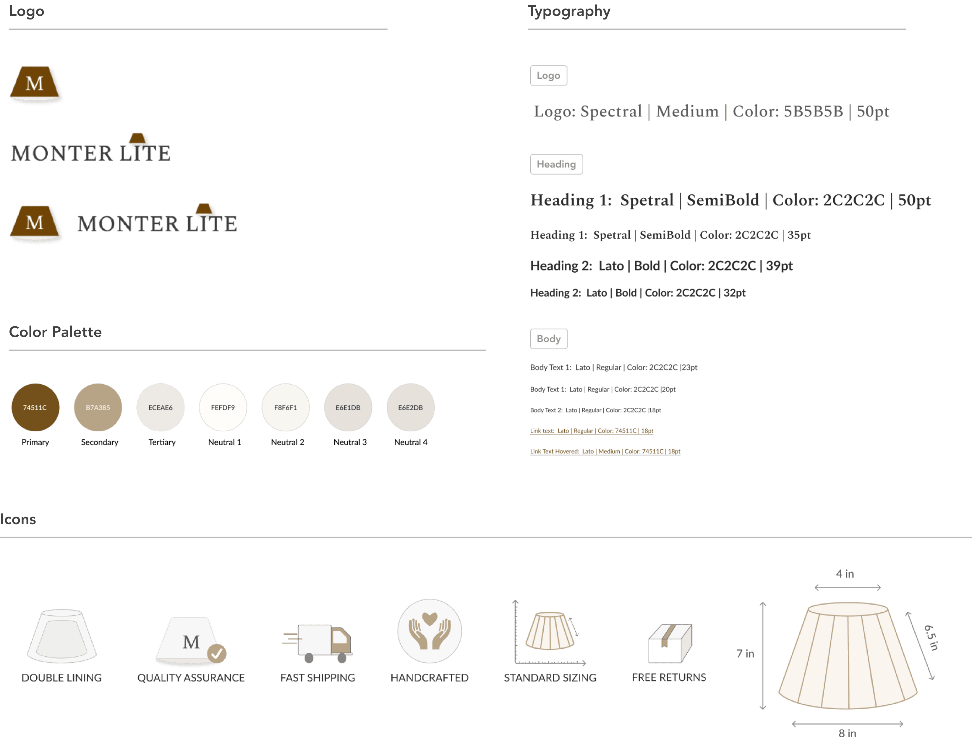
In our dialogue about the website's aesthetic direction, the client specified a preference for keeping brown and neutral hues as the foundational color scheme. Their requirement was straightforward—they envisioned the website’s color palette to convey warmth, mirroring the inviting luminance of a lampshade.
Regarding the logo, the client preferred to keep their original logo despite its outdated design and low resolution. However, recognizing that the original logo would not fit well with the redesigned website, I chose to showcase the benefits of updating the logo to match the new design. To preserve the logo's original feel, I meticulously recreated it to closely resemble the original, selecting a font very similar to the original and fine-tuning the brown color to match the original shade as accurately as possible. This approach modernized the logo while respecting its original character.
usability testing
The usability test on Monter Lite’s website redesign has unveiled insightful feedback, revealing areas of strength and potential areas for improvement. Four participants were recruited for the usability test and were tasked with using the website to locate and purchase the "Hailey Linen Lampshade". This task enabled close observation of their navigation experience, from initiating the search to completing the checkout process. Feedback was then collected regarding the aesthetic appeal, functionality, and overall user experience. While the results were mostly positive, participants offered constructive suggestions to further refine the website's design.
Landing Page | Home Page

First Version
User proposed setting the image as the background for the hero section for a refreshed, modern appeal
Participant observed that the homepage lacked clear section divider
Participants mentioned that it would make sense to have the website's products visible near the top of the page.

Final Revision
Expanded the photo to fill the background of the hero section
I adjusted the placement of the "Best Sellers" and "About Us" sections, enhancing clarity for users about the website's focus on lampshade sales.
Adding clearer division(background) between different sections to improve clarity.
Product Detail Page

First Version
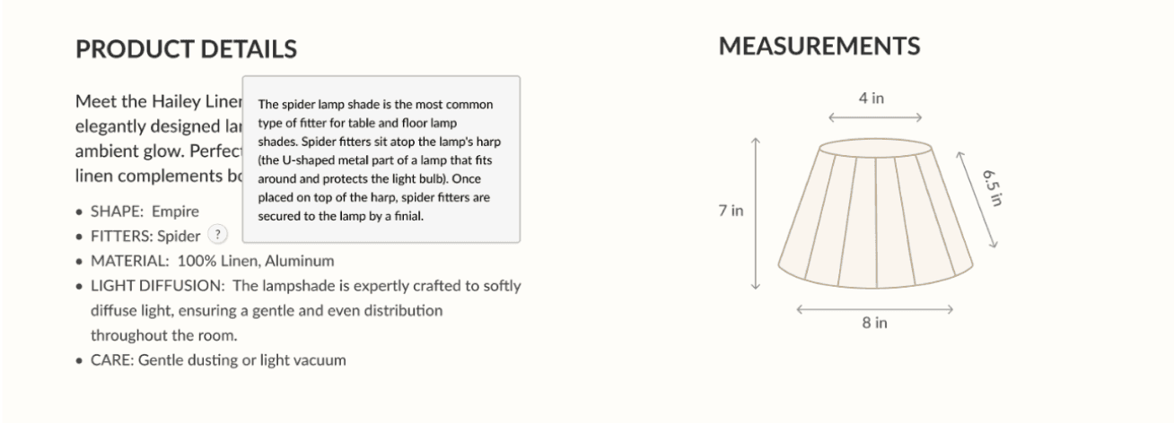
Participants wanted to know the height of the lamp.
2/4 participants expected explanatory icons next to jargon term.
Final Revision
Explanatory icon were added to to explain what “spider” is
When hovered to the explanatory icon
Incorporated the height of the lamp into the measurements to enhance clarity.

Cart Page
First Version
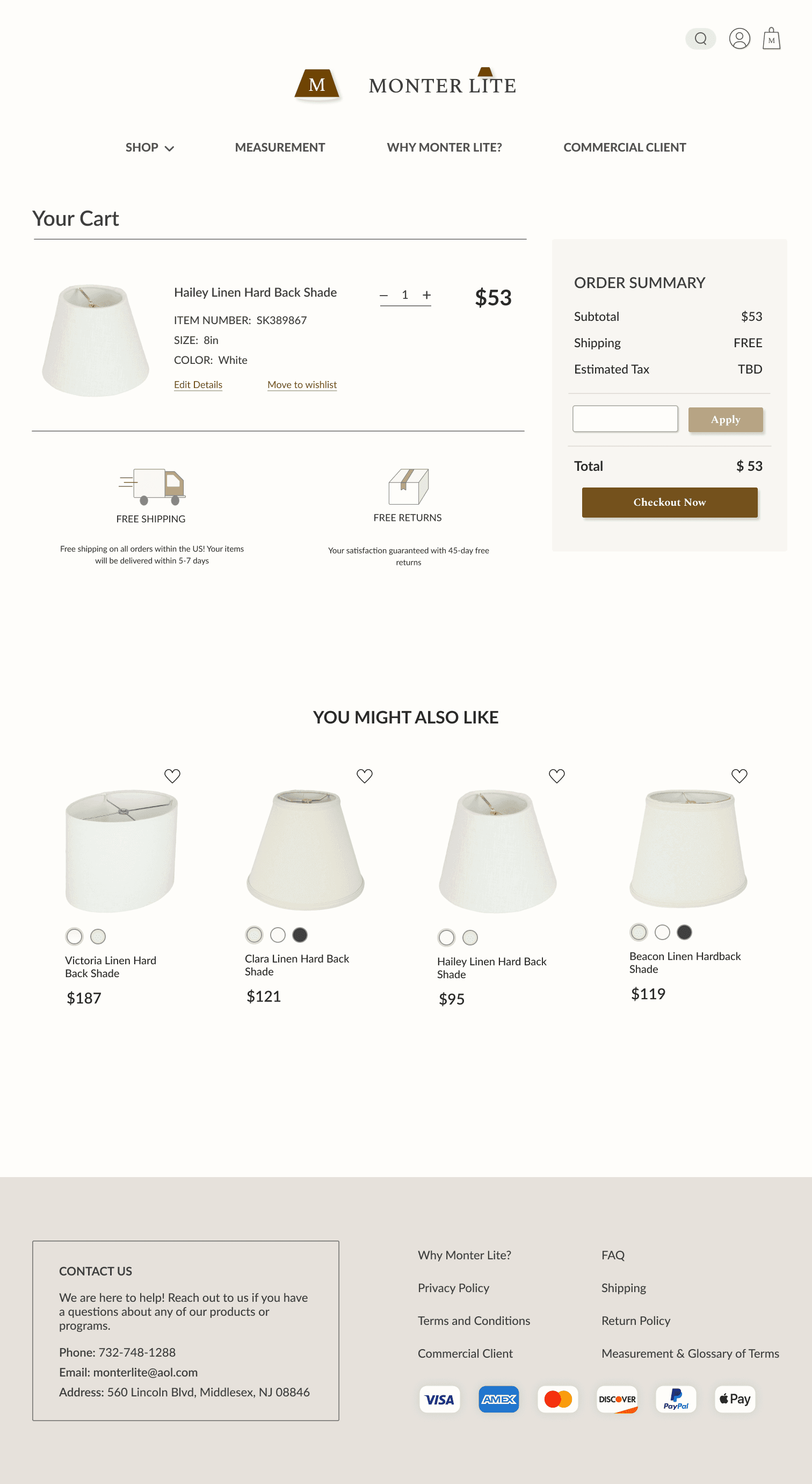
Usability participant expressed the need for a “Remove Item” button in the cart.
Final Revision

“Remove Item” button was added, allowing users to easily discard unwanted items before checkout.
Checkout Page #1
First Version
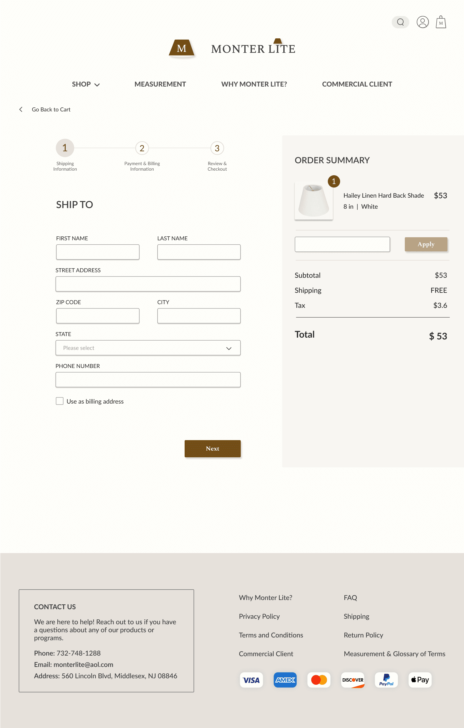
3 out of 4 participants recommended using exact pricing with endings like .00 or .99, as it appears more familiar to them.
Final Revision
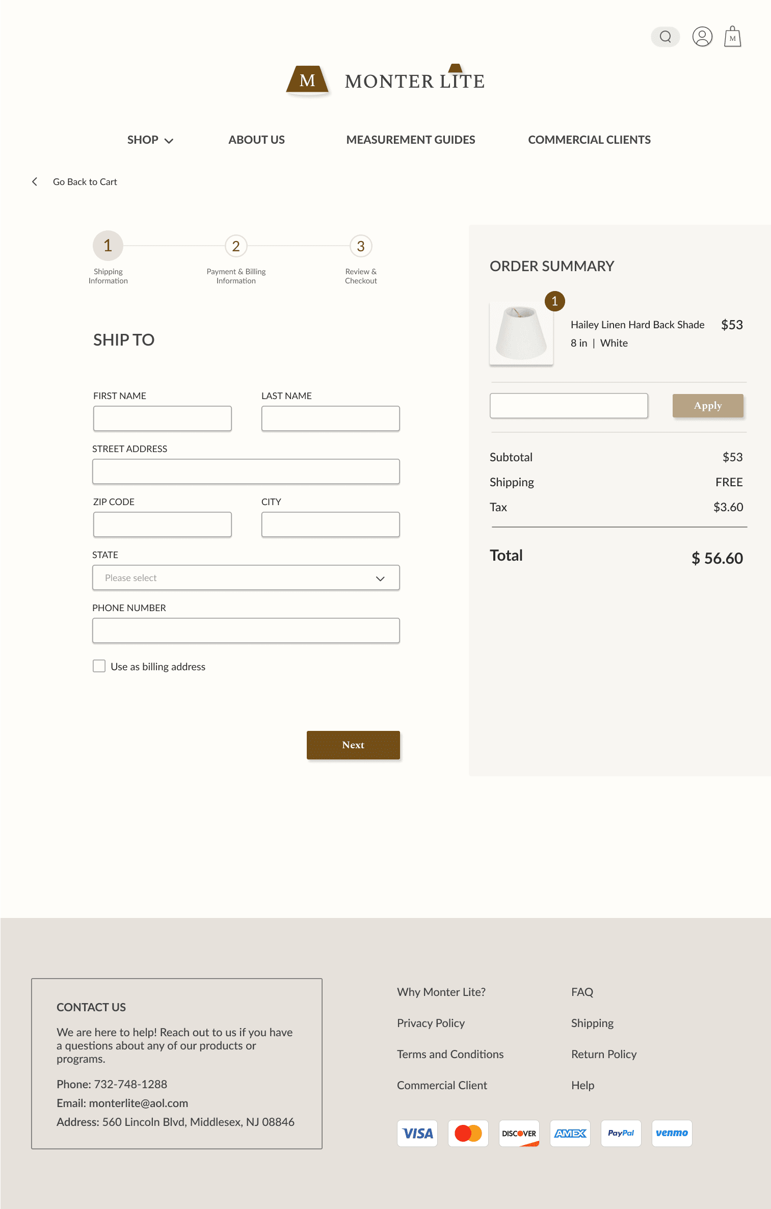
I updated the total price display to show the exact amount, aligning it with industry standards.
Checkout Page #2
First Version
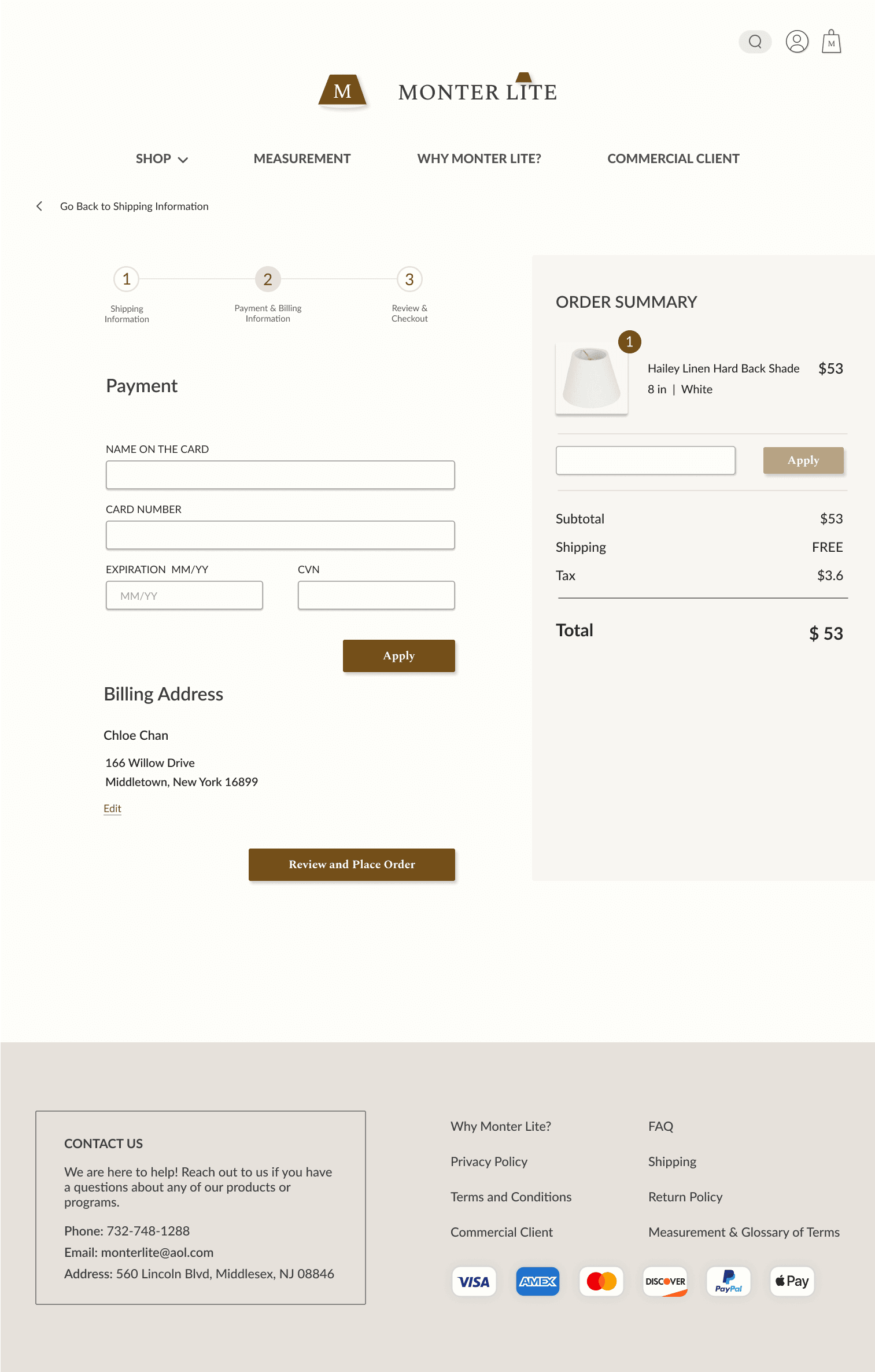
Tester expressed that the “Review and Place Order” button was misleading, as it led users to the review order page instead of immediately placing the order when clicked.
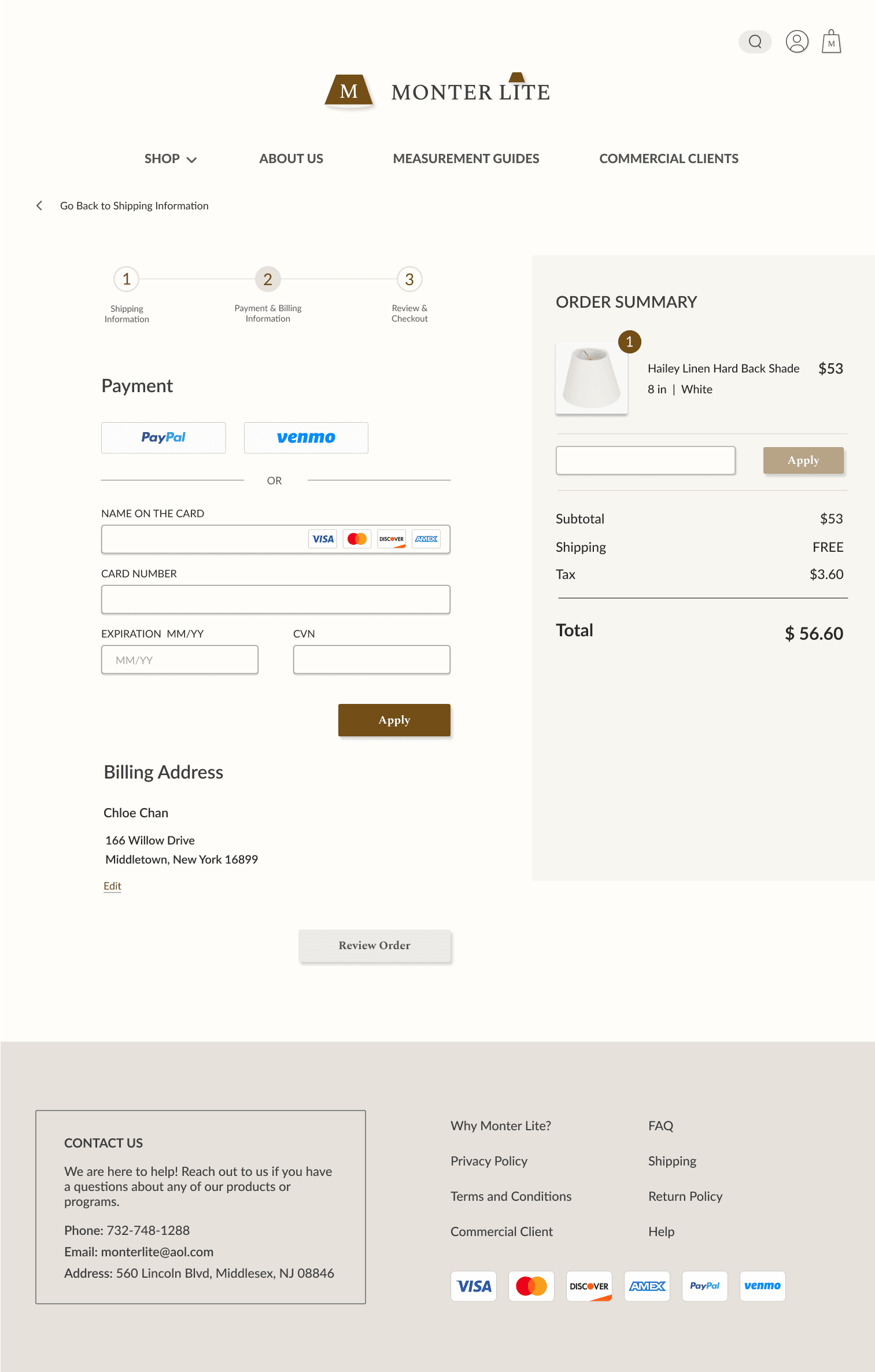
3 participants expressed the payment information entering page did not provide users with the options to choose from different payment methods, even though multiple payment methods were listed in the footer.
Final Revision
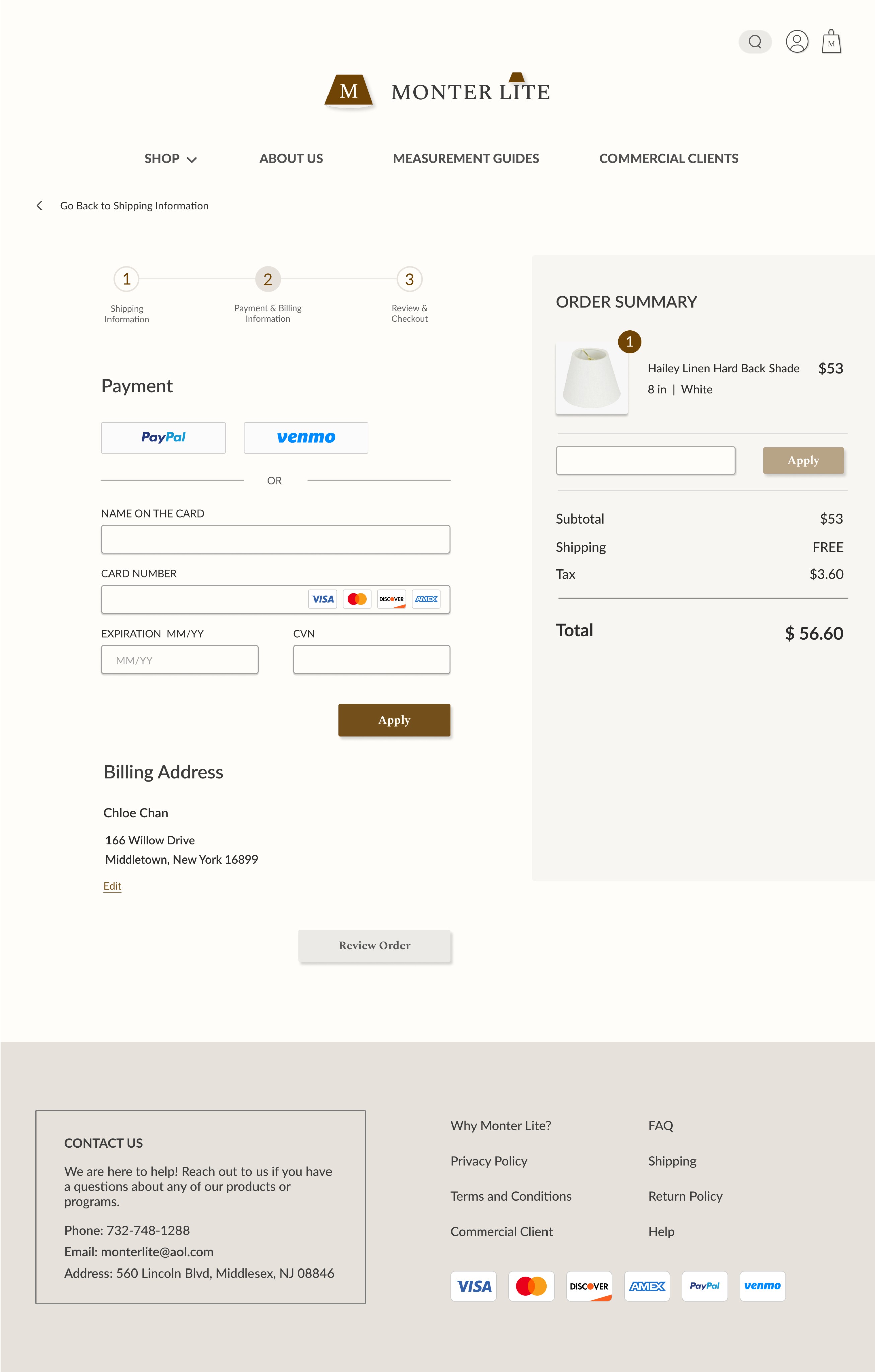
I changed the button to "Review Order" for a clearer description of the next step.
Added different payment methods
Checkout Page #3
First Version
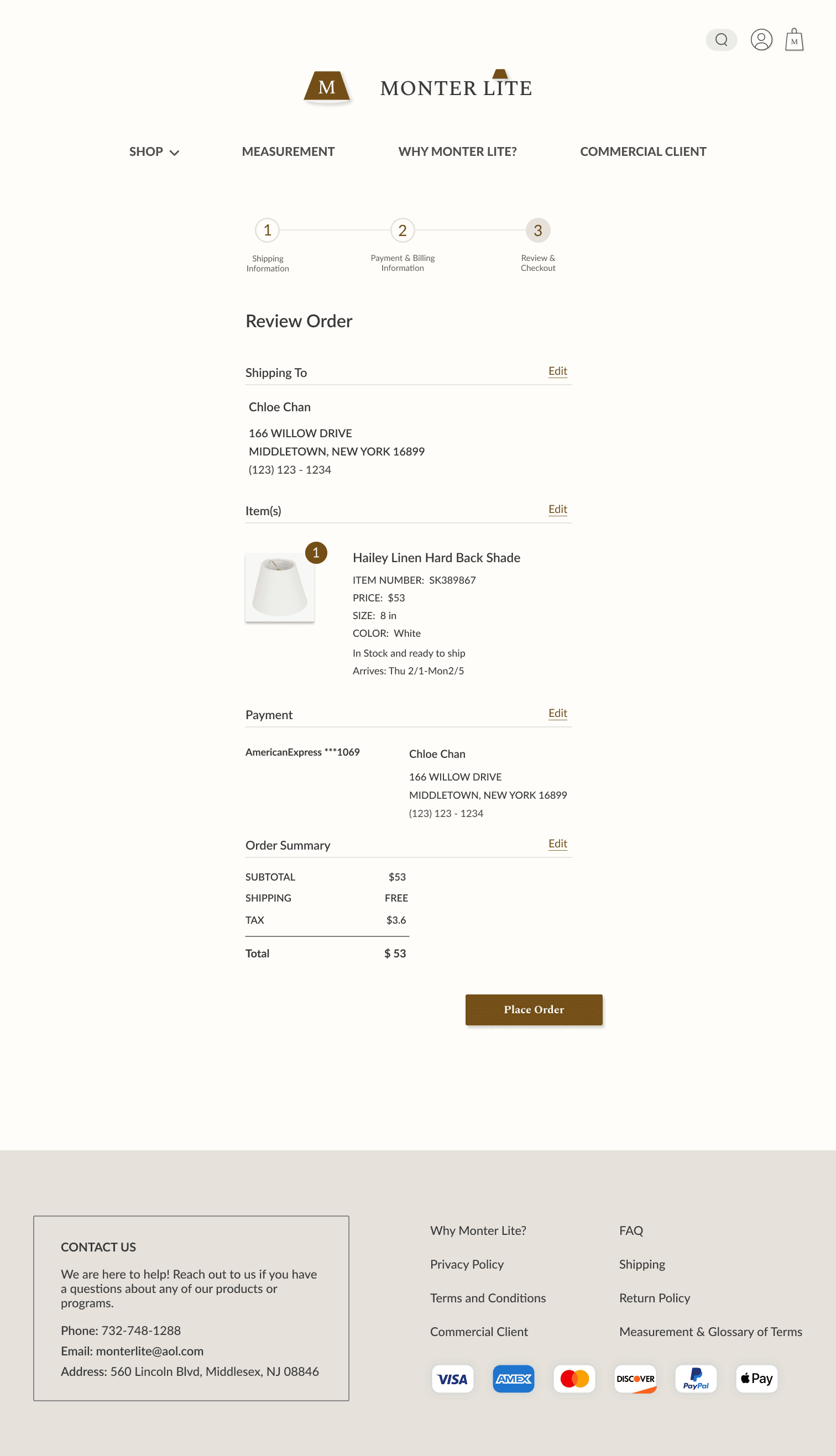
Participant pointed out that the order summary on the review order page displayed an imbalance in space usage when compared to the other information above it in the design.
Final Revision
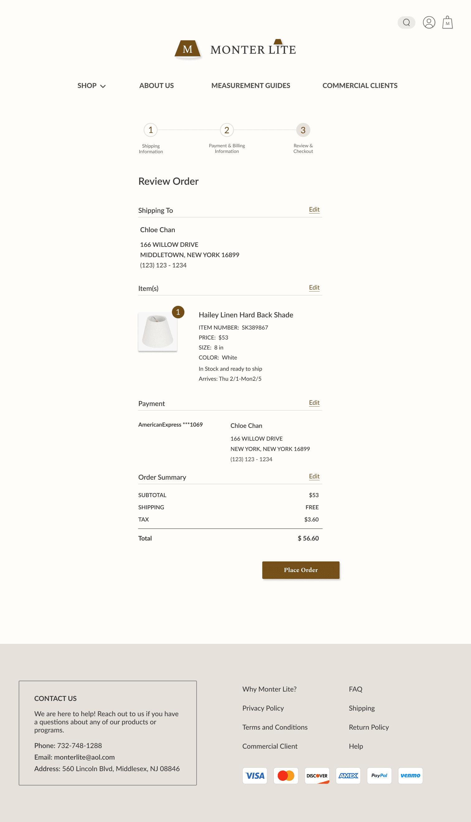
I resized the order summary to achieve a more balanced look with the rest of the design.
FINAL DESIGNS
FINAL PROTOTYPES
After two rounds of revisions following usability tests, here are the final prototypes showcasing the entire shopping experience on Monter Lite's website.
Shop for a Desired Product & Add It to Cart
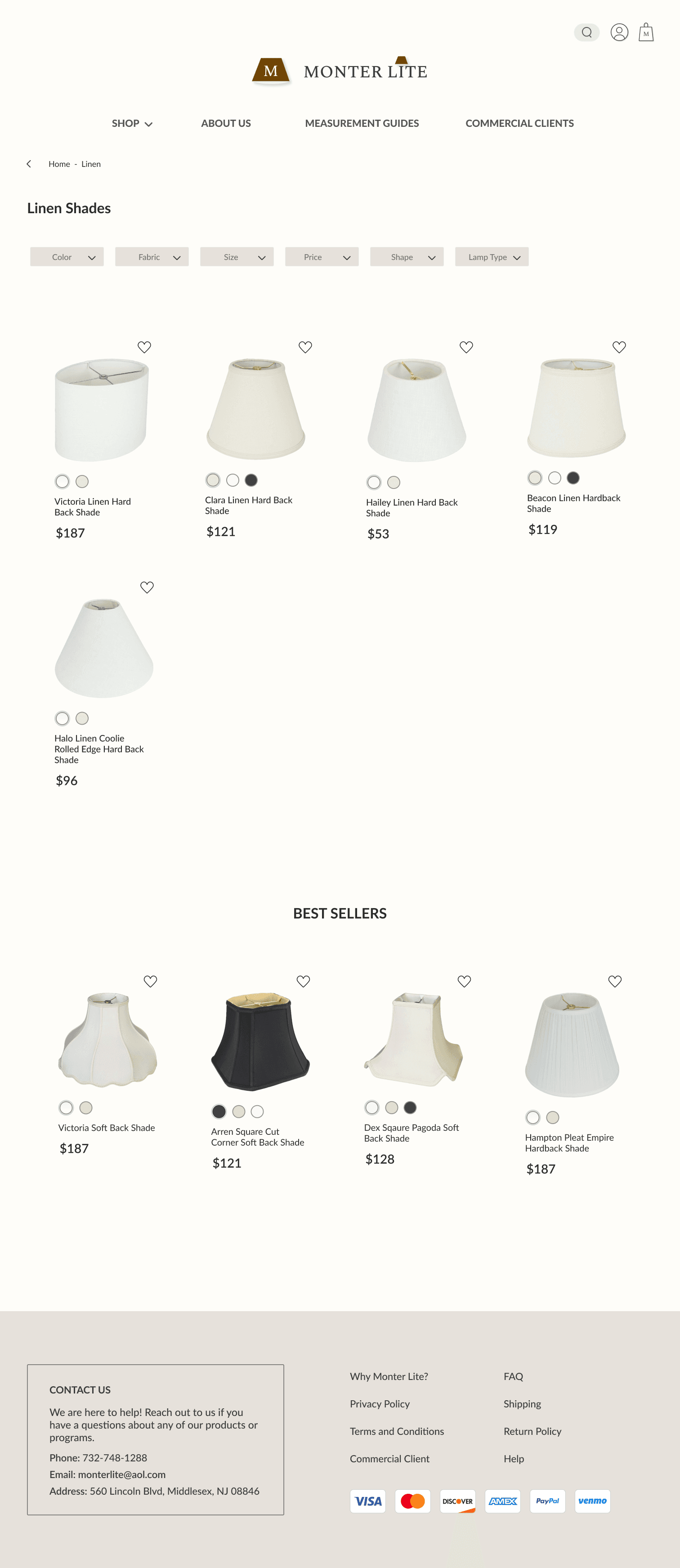
The prototype demonstrates one of several methods available on the site for locating specific product types, in this case, "linen" lampshades.


Checkout
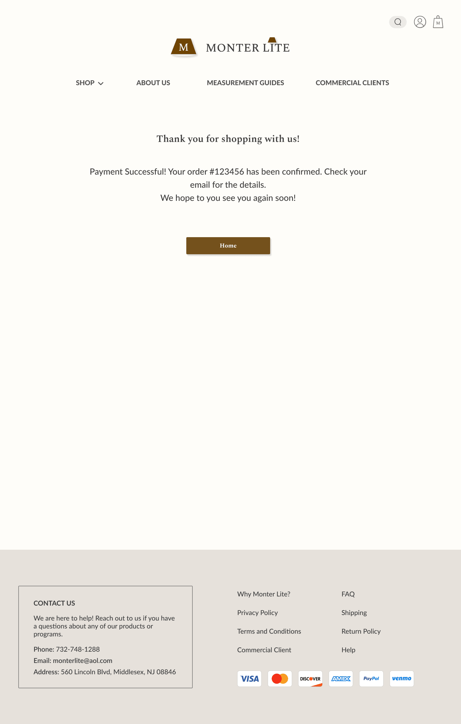
The prototype is showcasing the entire checkout process that users experience when making a purchase on the Monter Lite's website.
Conclusion
Reflection
This experience was incredibly valuable. After communicating with stakeholders and understanding their needs, I redesigned and rebranded their website specifically tailored for them. Completing this website redesign project through collaboration with the stakeholders significantly enhanced my skills in client communication. Throughout the design process, I paid great attention to every choice and detail on the website, ensuring that the design aligned with Monter Lite's values and aesthetics. Ultimately, the stakeholders' high level of satisfaction with the redesign underscored the project's success.
Next Steps
Moving into the next stage of Monter Lite’s website redesign, I will be working on:
Evaluating the impact of the redesign and rebrand on Monter Lite's profitability.
Continuously refine the UI library for improved design consistency and usability.
Explore new features with the potential to enhance the shopping experience for users.
CHLOE CHAN 2024
CHLOECHANSEMAIL@GMAIL.COM
