
OVERVIEW
In today's fast-paced world, finding the perfect spot for a boba tea or coffee fix has become more than just a simple preference—it's a daily life adventure for many, symbolizing relaxation, joy, and social connection. Venti is the ultimate app designed to bridge the gap between boba and coffee lovers and their next favorite spot. Venti’s mission is to provide a seamless, enjoyable discovery process for users looking for the perfect blend of ambiance, taste, and convenience.
Role: UX Designer
Tools: Figma & Canva
Date: Feb 2024
Problem
People currently navigate through a mix of different apps to discover local boba and coffee spots, each with its own set of benefits and limitations. The market lacks a dedicated, all-in-one app that brings together the best features of these platforms, specifically catering to the boba and coffee shop enthusiasts.


Solution
To perfect the process of discovering local coffee and boba shops, we crafted Venti — a comprehensive, user-centric app that distinguishes itself by integrating the best features from existing café-finding platforms. additionally, Venti also centralizes the tracking of users' rewards for all shops within one app, streamlining the search and reward management process to enhance the overall experience of finding the perfect spot.

Competitive Analysis
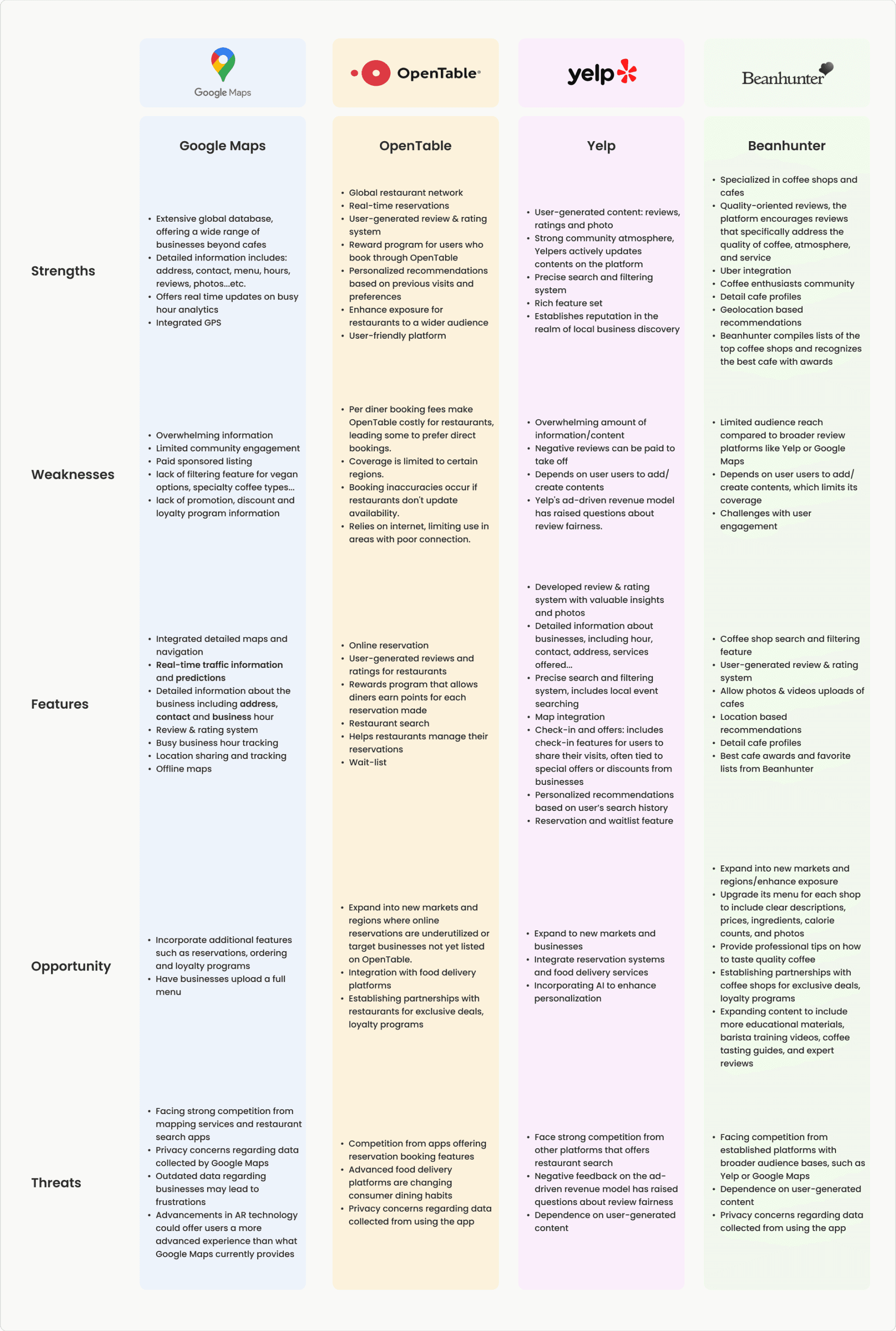
During Venti's competitive analysis, four main competitors were thoroughly analyzed to pinpoint their market strengths, weaknesses, and strategies. This thorough review guided the enhancement of Venti's design and features, aiming to significantly improve user experience and satisfaction beyond standard industry expectations.
User interviews
The interviews were aimed to reveal the strengths and shortcomings of existing coffee and boba shop discovery apps. The feedback obtained was crucial in highlighting opportunities for Venti to bridge the gap, effectively marrying user needs with the features other apps lack.
Number of interviewees: 4
Interview platform: Zoom
Duration per interview: 30 minutes
Interview Findings and Proposed Solutions


INTERVIEW SUMMARY
Optimizing Cafe Search Experience with Venti
Background:
In discussions with four interview participants, Venti aimed to uncover common trends in cafe search behavior and identify areas for improvement.
Findings:
The interviews revealed that most users preferred Google Maps and Yelp for locating cafes. However, their feedback on these platforms varied, highlighting the need for a more tailored solution to accommodate diverse preferences.
Opportunity:
The diversity in user satisfaction presents Venti with a valuable market opportunity. In response, Venti has chosen to focus on integrating features that align with current market preferences onto its platform. This strategic initiative aims to simplify the search process and minimize the inconvenience of app-switching due to missing functionalities, solidifying Venti's position as the go-to solution for searching nearby cafes.
MVP FEATURE SET
The MVP feature set for Venti was developed to efficiently launch the app, concentrating on essential functionalities that enhance the user experience.
The "Must Have" section is designed to deliver immediate value and establish a solid foundation for future enhancements, tailored according to user feedback and evolving market needs. Additionally, the "Nice to Have" and "Can Come Later" sections outline features planned for future development, enabling Venti to expand and refine its offerings as the app matures.
MUST HAVE
Sign in & Sign up
Geolocation search
Shop profile page
Cafe search & filtering system
Shop categories
Menu
Real-time updates on peak hours
Review & rating system
Rewards tracking
Coupon & promotional info
Bookmark
NICE TO HAVE
Specialty drink section
Caffeine content information
Individual item review and rating system
Nearby promotions
Help center
FAQ
CAN COME LATER
Landmark based navigation
User-friendly & fast review process
Categorized bookmark
Ordering feature
Group order feature
Reserve seats
HOW MIGHT WE...?
"How might we" statements were crafted after the research phase to ensure that Venti's approach is centered on user-centric problem-solving. This strategy aims to address issues that users encounter on other platforms, while also introducing innovative and helpful features that are currently absent in the market.
How might we assist users in minimizing frustration associated with managing rewards programs from various shops?
“
During the early research phase, interviewees voiced frustration over keeping track of rewards from shops and would prefer to have all such promotional information consolidated within the app itself.
Interviewees also expressed inconvenience when reviewers failed to specify the names of drinks in their reviews.
How might we prevent confusion when reviewers fail to specify the names of drinks in their reviews?
“
User Personas
User personas were crafted post-interviews to better understand user needs, allowing for platform customization to match user preferences, fostering empathy with their experiences, thereby shaping Venti into a user-centric product.


User flow & Task Flow
User and task flows for Venti were designed to streamline the journey from signing up to finding and navigating to a desired café, ensuring smoothness throughout.
information architecture
The sitemap was key in organizing Venti's content, particularly streamlining the process for users to find and navigate to cafés. It detailed the journey from the homepage to café details, ensuring users smoothly transition from searching to getting directions. This focus significantly improved the user experience, making Venti more intuitive and user-friendly.

Branding
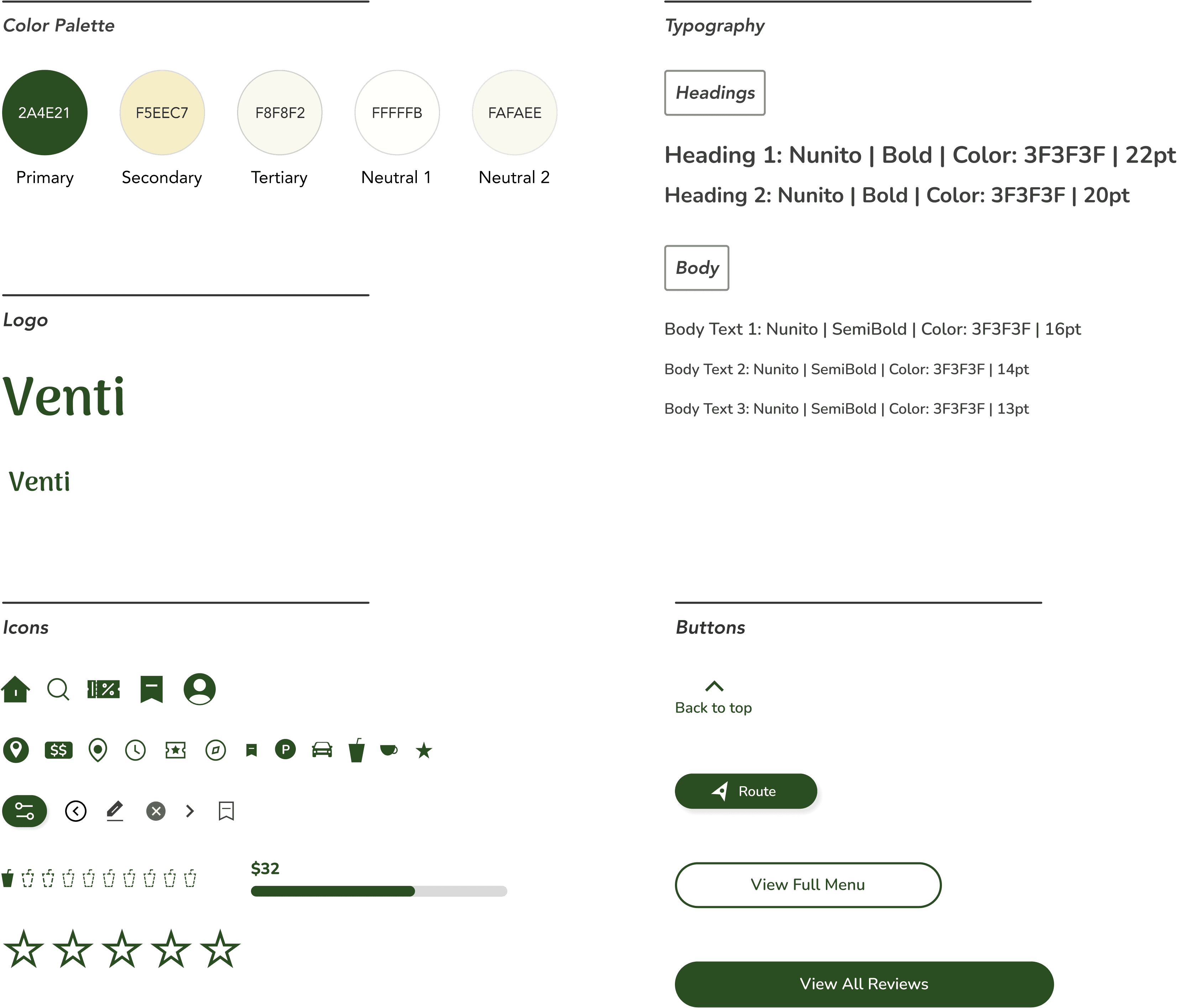
The name "Venti," inspired by Starbucks' large drink size, targets individuals deeply passionate about coffee and café culture. This choice signifies a vast and immersive exploration of cafés, appealing to those seeking more than just a drink but a rich experience in the diverse world of coffee and beverages.

Mid fidelity wireframes
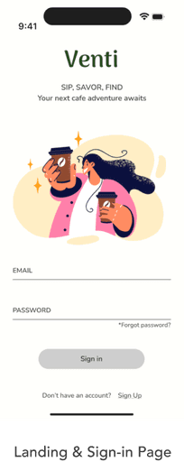
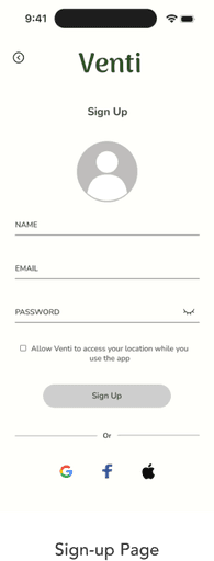
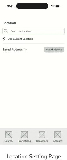
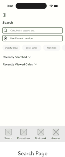
During the initial research phase, I conducted a thorough analysis of several competitors' interfaces. I observed a common trend among these interfaces: they often provide an abundance of information, leading to a cluttered user experience. When creating mid-fidelity wireframes for Venti, I aim to maintain a simple and clean structure. I consciously limit the amount of information displayed on each page, focusing on enhancing usability and ensuring a streamlined user journey.
Usability Testing & Revisions
When conducting usability tests on the Venti app, five testers dive into the full experience — finding a nearby boba shop, getting directions, and using any deals or promotions they found on Venti. Additionally, they completed a task to track their rewards.
Despite some initial confusion when locating the rewards tracking feature, all participants were able to successfully finish their tasks, and plenty of feedback were gather to further refine the user experience.

Before
(Feedback from testers)
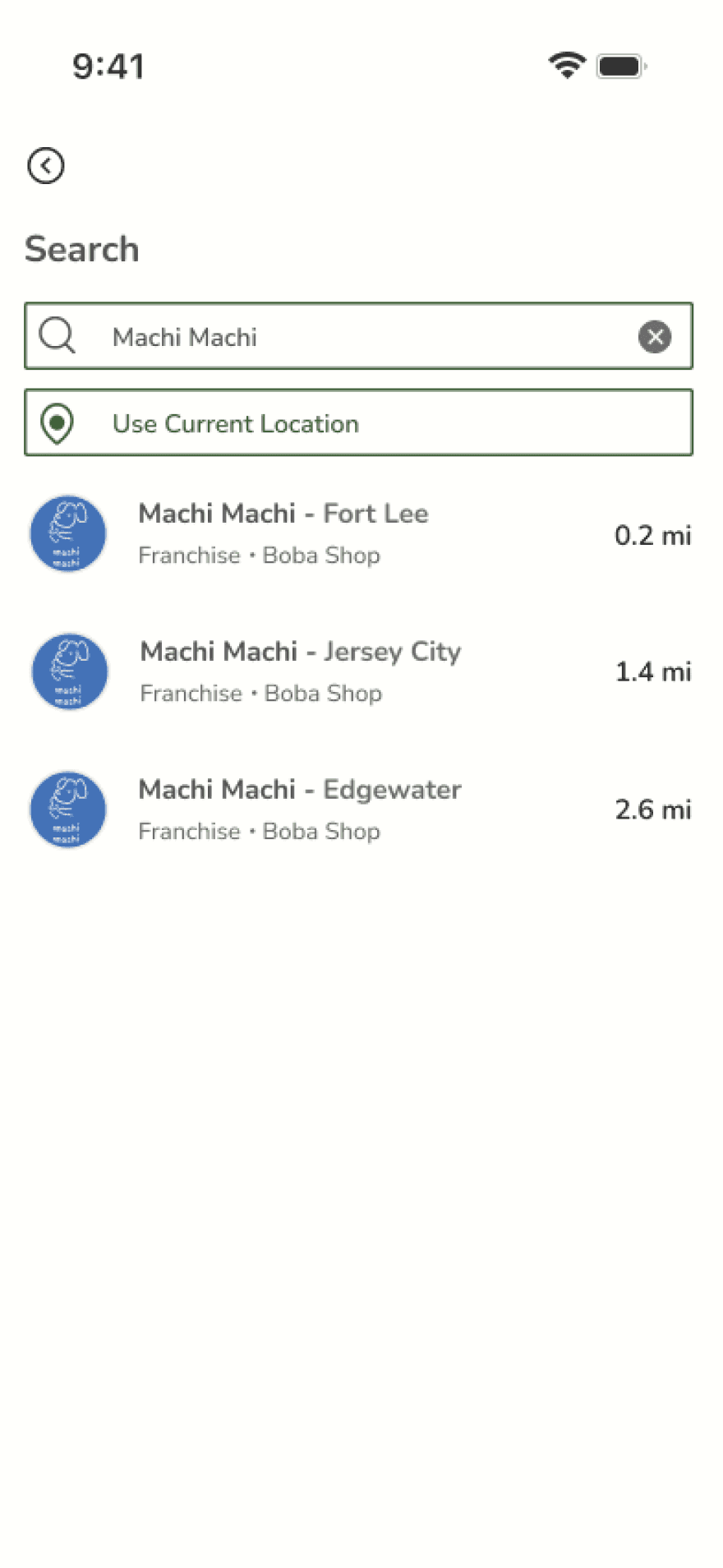
Users anticipate being able to see both the distance to the shop and the locations of multiple shops, if available.
(Solution(s))
After
Incorporating shop distances enhances decision-making by revealing the proximity of cafés to the user.
Specifying the café's city enhances users' grasp of its location.
Search Result Page
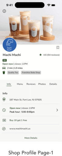
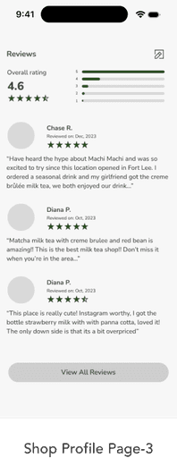
Shop Profile Page
Before
(Feedback from testers)
(Solution(s))
After
During the usability tests, testers were assigned the task of locating MachiMachi’s promotion. It was observed that three out of five testers required additional time to find the promotion. Subsequently, when asked for feedback, they expressed that the promotion lacked prominence.
Testers mentioned they'd find it handy if the menu could float, so they can access it easily no matter where they are on the page.
Usability test participants found the menu too lengthy and suggested making it collapsible to reduce scrolling.


To enhance the visibility of the promotion, it is being highlighted with green coloring and increased boldness
Floating menu
Implemented a collapsible menu feature to prevent long scrolling and enhance user experience on the shop profile page
Shop Promotion Page
Before
(Feedback from testers)
(Solution(s))
After

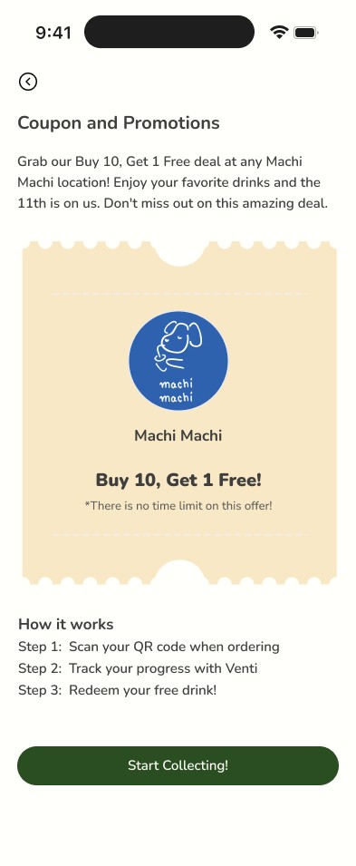
Tester expressed that the “Start Collecting” button on this page seems like it’s just for first timers. He suggested renaming it to something more inclusive that applies whenever points are earned
Integrating the rewards tracker on this page not only provides users with a convenient reminder of their previously accumulated points but also enables them to track their progress immediately after utilizing the promotion.
The button has been renamed "Scan QR Code" based on user feedback to improve clarity and usability.
Drink Detail Page
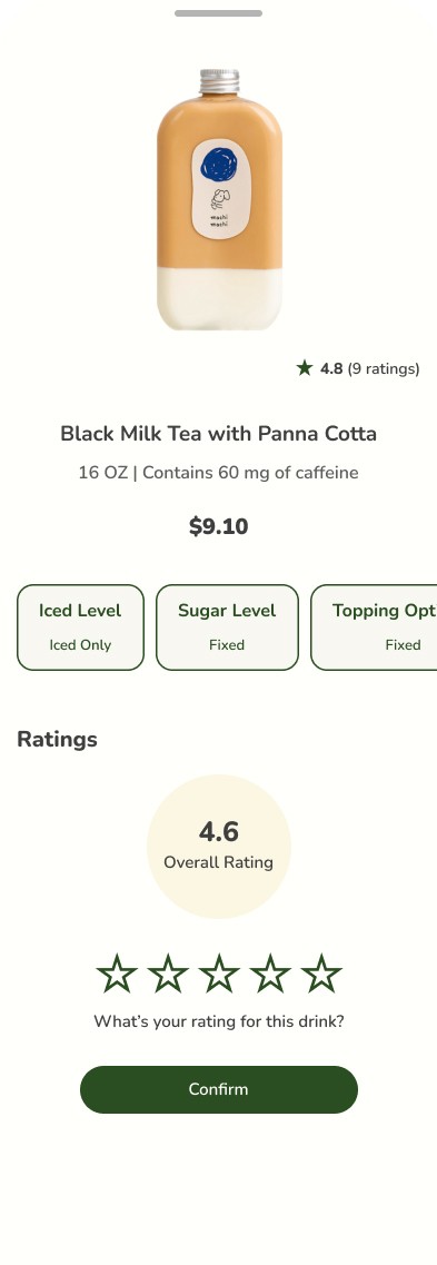
The drink detail page was developed during the revision phase after extensive usability testing. Initially overlooked due to time constraints in the hi-fi wireframe creation, this page was designed and implemented during the subsequent revision process
FINAL PROTOTYPE
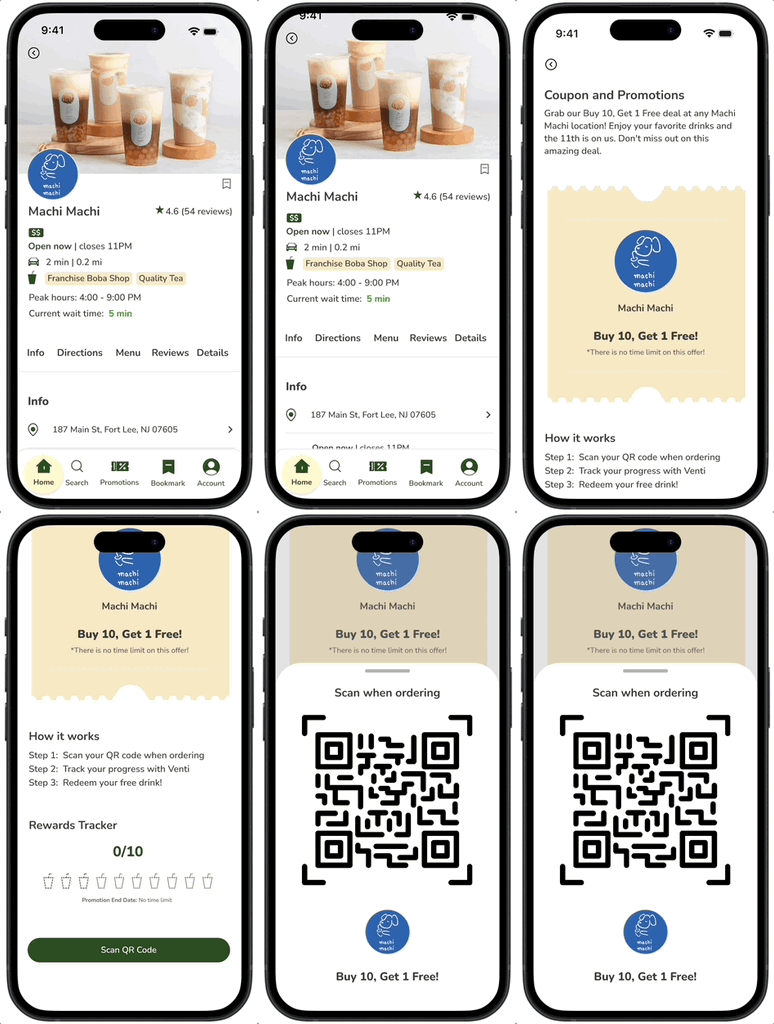
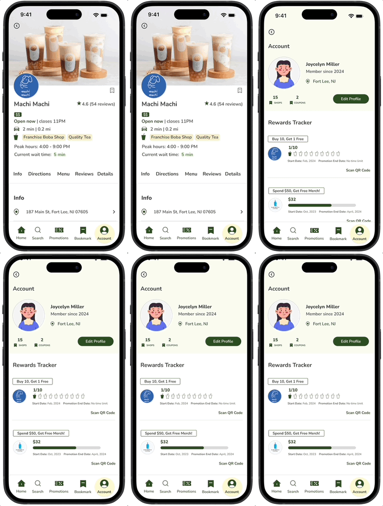
After refining the design based on user feedback from usability tests, here are the final prototypes showcasing Venti's main features: nearby cafe searching; a shop profile page that provides information about the shop; integrated GPS navigation; promotion redemption; and rewards tracking.

Account Creation & Menu Item Details
Browse or search nearby cafes
Provides information about shops, including their menus.
Routing
Integrated GPS navigation within the app.

Redeem Promotions Within the App
Venti provides information on promotions and enables users to redeem offers directly through the App.
Rewards Tracking
Venti offers a single platform for users to manage all their rewards from different shops, streamlining the process and preventing confusion
Conclusion
Reflection
Throughout this process, I found myself wearing multiple hats, effortlessly transitioning between being an innovator, a problem-solver, a designer, and a user advocate.This experience has been instrumental in shaping me into a more well-rounded, independent UX designer, equipping me with a diverse skill set and a deep understanding of user-centric design principles. It has sharpened my ability to navigate complex design challenges with a balanced approach, always keeping the user's needs at the forefront of my work.
Next Steps
During the early stages of the app's development, my focus was centered on crafting screens for the key features, defining the app’s architecture, integrating essential features, and establishing the overall navigation flow.
Moving into the next stage of the app’s development, my attention will shift towards:
Comprehensive enhancement of the software, with a detailed focus on thoroughly designing each page to ensure both functionality and aesthetic appeal.
Conducting broader testing with a diverse audience to evaluate the app's value and gauge the potential for its adoption.
Implementing iterative testing and revision processes to fine-tune the software, aiming to ensure its performance, user interaction, and overall usability meet and exceed user expectations.
CHLOE CHAN 2024
CHLOECHANSEMAIL@GMAIL.COM


